Role
The team
Introduction
Our team initiated a redesign of PruveSign to address low engagement, resulting in a 25% increase in user engagement
Context
PruveSign, an e-signature platform, aims to simplify and secure the electronic signing process using face-match and liveness check for identity verification.

Customers (paying customers) - Who are using PruveSign portal to create, share and review signed documents.
End-user - Who are using it just for signing the documents
Problem
The average user engagement rate was just 27%, meaning 70% of new users were not utilizing PruveSign after signing up

New users: People who signed up for PruveSign
New active users: Users who signed up and performed significant actions (e.g., template creation, sending, self-sign) within the last 30 days
Research
Internal insights
To uncover the root of the problem, I first consulted with the support and sales teams, followed by direct conversations with users. These are the insights I gathered from the internal teams:

Sales team
They were able to bring in new customers and felt that the acquisition process was on track

Support team
The support team was struggling to manage a large volume of repetitive inquiries
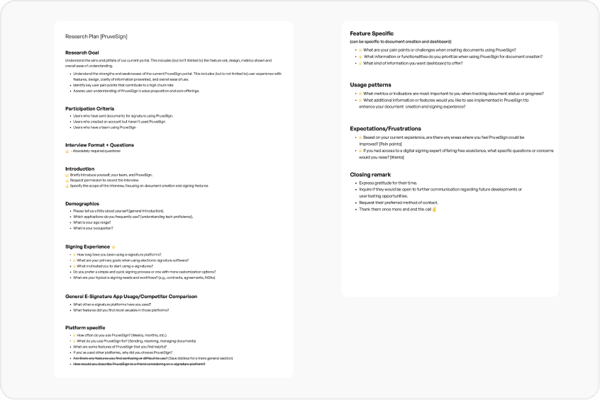
User interviews
I interviewed 6 customers which are a mix of new and existing customers. I prepared a interview guide and this helped me structure the questions, think through the flow of the interview and prepare follow-up questions

Common themes/issues (pain points) identified through internal collaboration and user interviews:

UX audit
I conducted a UX audit of the interface using Nielsen's heuristics, documenting and ranking issues by severity and impact. I presented the findings to the developers, manager, and CTO.

Objective
After discussing all these findings with the stakeholders (Leadership & team) we decided that, a major revamp in user experience is a must in order to mitigate at least these basic UX issues. I came up with an objective and discussed it with our team:
'How can we deliver a more efficient and intuitive user experience that boosts product engagement and overall satisfaction?'
In the first phase, these were the goals:
GOAL 1
🏗️ To achieve a more intuitive navigation, we need to simplify Information Architecture
GOAL 2
🎢 To achieve higher engagement and smoother onboarding, we need to create a step-by-step onboarding flow
GOAL 3
👁️ Enhance the visibility of the ID Verification feature by improving its accessibility
GOAL 4
👩💻 Make data and insights easier to track by redesigning the dashboard and sent screen
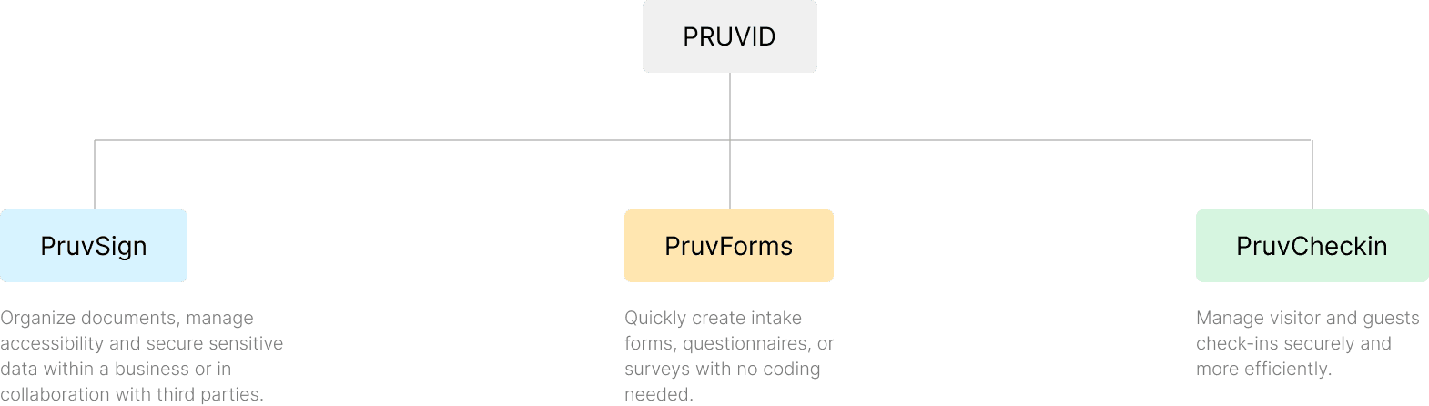
🏗️ Simplifying information architecture
PruveSign offerings -
Form creation and management
Check in with forms
Document signing
This decision to simplify the Information Architecture by segmenting the product into three offerings was a strategic business decision, my research insights played a key role in informing and supporting this direction

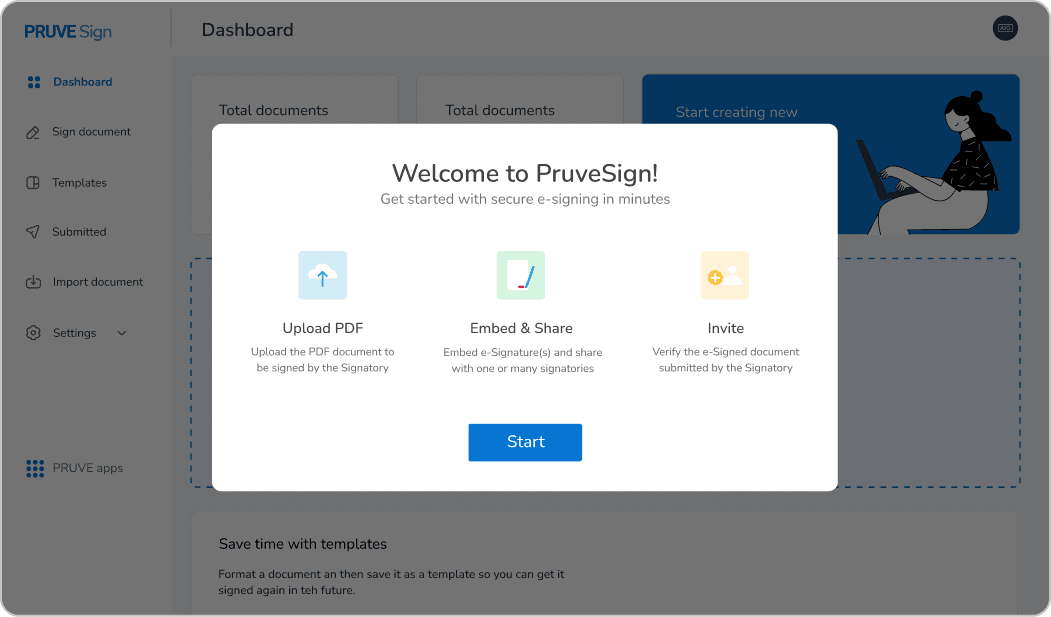
🎢 User onboarding
I used different onboarding approaches such as introductory modals, onboarding tour, tutorial guides and empty states and tailored the onboarding experience to the specific context and user needs at each stage.
Introductory modals and Onboarding tour

Tutorial guides
We trigger tutorial guides at the document creation screen, a point where user questions frequently arise, to guide them through the process effectively.
Empty states
Empty states can provide clear instructions or prompts to help users understand what actions they need to take to fill the empty space. This is particularly helpful for new users.
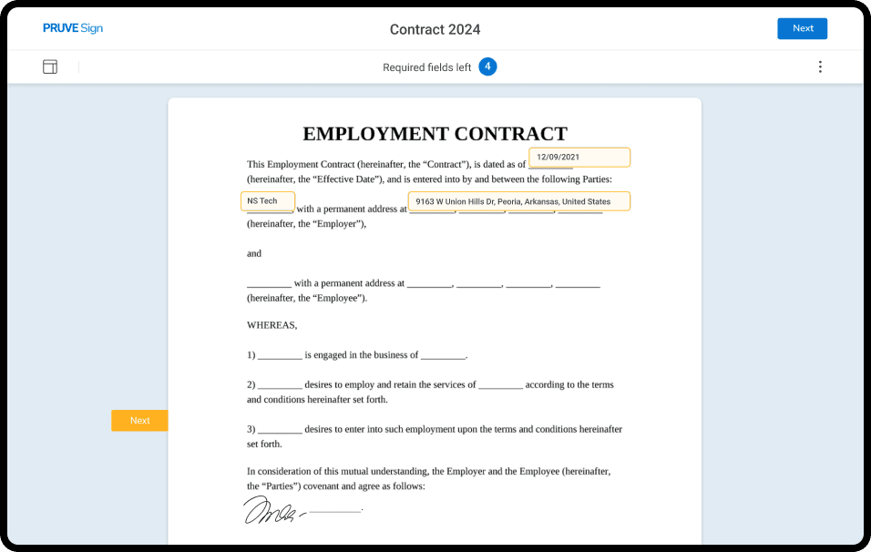
👁️ Identity verification feature
PruveSign's key selling proposition (USP) is its ID verification feature for signers. However, feedback from interviews revealed that users desired the ID verification feature, which was already available.


Proposed solution
Given the importance and necessity of this feature, I opted to incorporate it at the initial step where users input the names and IDs of recipients.


Usability testing
We conducted usability testing to validate our proposed solution. This testing ensures that our design assumptions align with user needs and expectations.
We asked them to send documents for signing , and to our extreme delight all users were able to intuitively start and complete their document sending process, understand and use the ID verification feature and had almost no hiccups along the way.
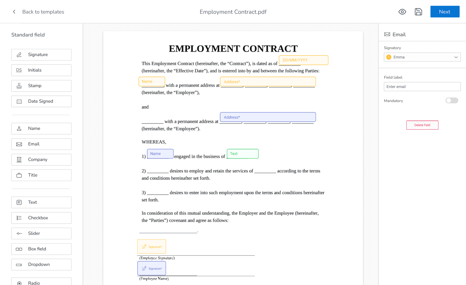
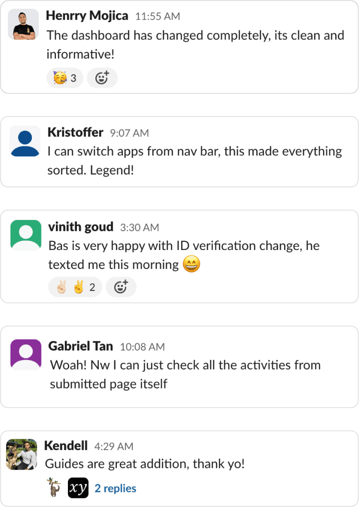
👩💻 Track/data insights
As the research revealed, users, especially administrators, were unable to track data from anywhere in the portal. To address this, we're focusing on enhancing data tracking functionalities within the Dashboard and Sent documents sections.
Dashboard

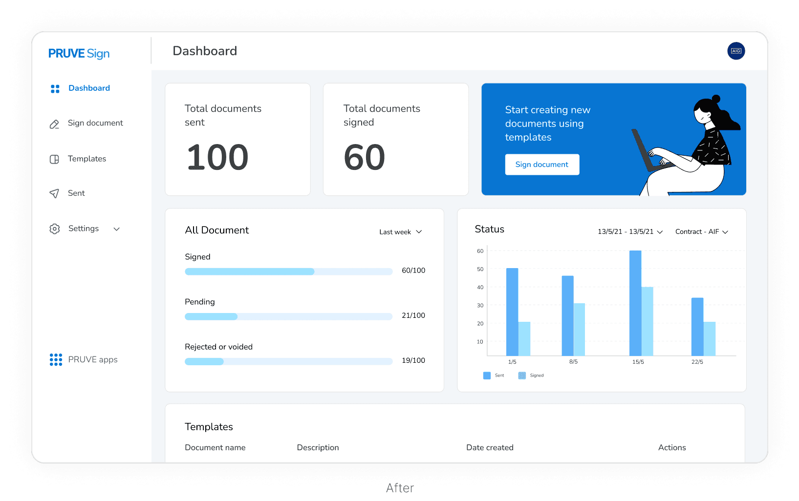
The redesigned dashboard was dedicated to PruveSign, making it easier for users to track data only related to signing documents.
I kept the card-based approach in the redesign as cards are also conceptually easy to understand.
I included relevant KPIs and charts for data visualization, helping users to quickly grasp trends, patterns, and identify areas needing attention.
Sent documents screen
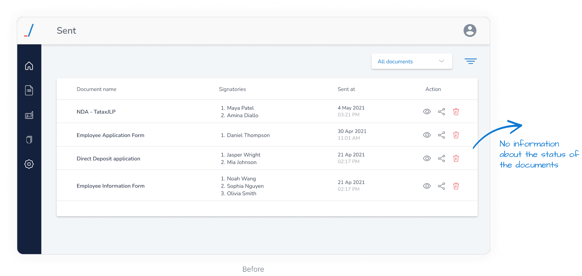
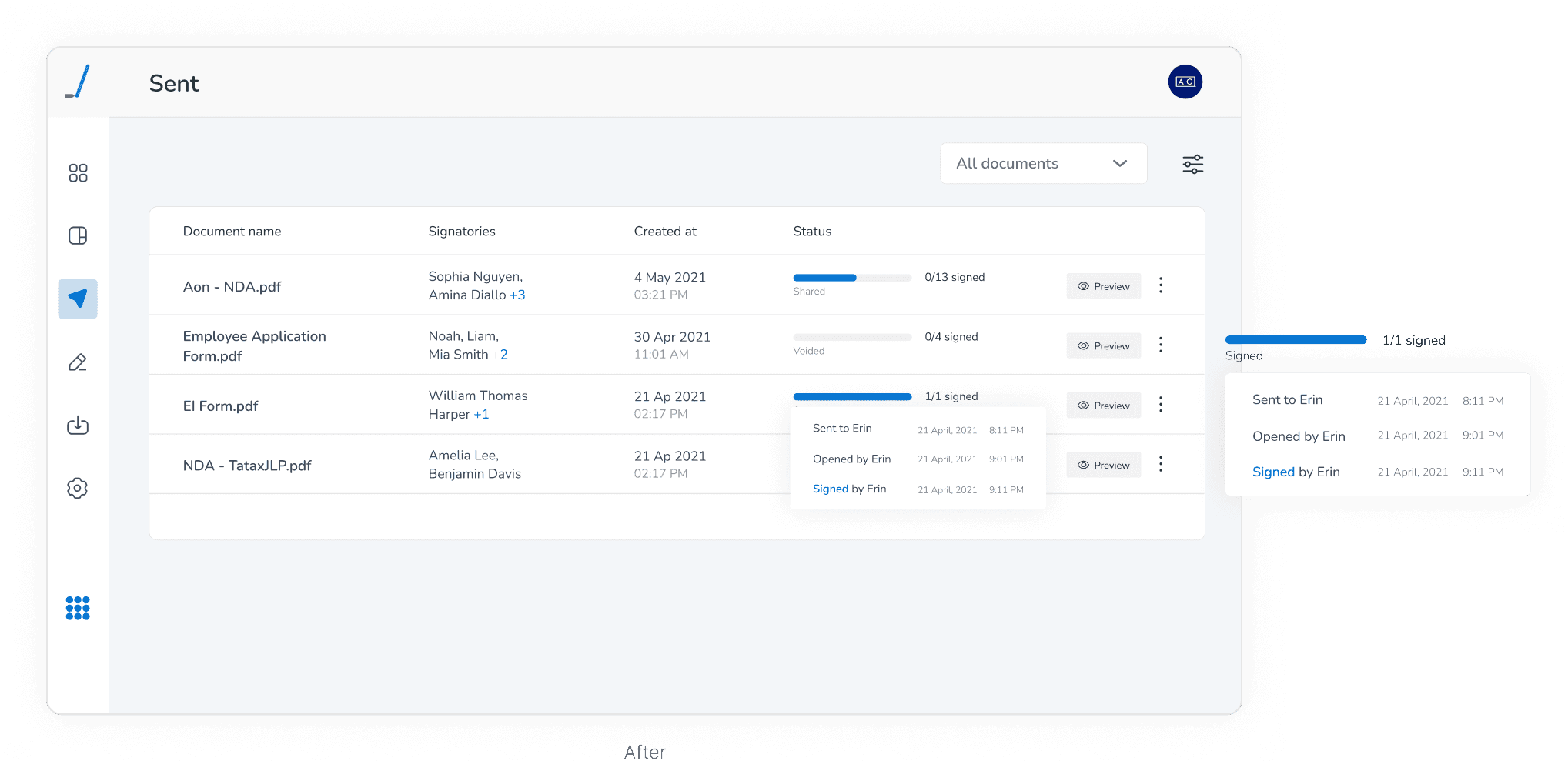
Track document status at a glance: Admins can now track the status of sent documents without opening them individually, thanks to intuitive progress bars.
Progressive Disclosure for signer activities: To avoid information overload, I utilised progressive disclosure. Admins can hover over the progress bar to reveal a popover displaying detailed signer activities.
Designing for the road bumps: Edge cases
Order of signing
Documents requiring signatures from multiple parties where the sequence or order of signing is crucial, leading to confusion or errors in signing order.

Verification oversight
Face-match and liveness detection in PruveSign utilize machine learning models, which may occasionally fail to achieve accurate results. To address this, admins can manually approve or reject ID verification attempts. This oversight ensures that ID verification remains reliable and secure, despite occasional algorithmic challenges.
Document validity period
Documents that have a limited validity period during which they remain legally enforceable (e.g., contracts with expiration dates)

Admins can set a document validity period upon sending, ensuring documents remain valid for specified durations. This control enhances compliance and clarity.

Signers receive regular email notifications regarding document validity, promoting timely action and compliance with deadlines.
Client-side data processing
A client wants to handle sensitive data like face match and ID verification on their own servers for better privacy and security, instead of using PruveSign’s servers.
To solve this, our developers created an npm library for clients to handle ID verification locally, keeping sensitive data secure. The library includes customizable UI components for easy integration into client websites.
Kudos to our development team for handling this 🙌
Let's talk impact
⭐️ Increased User Adoption
25%
increase in the number of active users on the platform compared to the pre-redesign period
👁️️ Identity Verification feature
41%
increase in the feature adoption, with users easily finding and using the ID verification feature
🤩 User Satisfaction
4 out of 5
users were happy with the new design and features.
☎️️ Support Inquiries
4 out of 5
support team members reporting a significant decrease in inquiries related to navigation, the verification feature, and data tracking

Learnings & takeaways
Limited time
When the time is limited, it’s crucial to identify the most critical pain points and focus on solutions that will deliver the most value within the available time.
Effective use of onboarding techniques
The integration of various onboarding methods (pop-ups, contextual tips, interactive tours) demonstrated that a multi-faceted approach to user education can significantly improve user adoption and reduce confusion.
Data-driven design decisions
This project showed me how data-driven decisions can have a significant overall impact on key performance indicators and user engagement.
Effective stakeholder communication
This project also improved my ability to present my work effectively to various stakeholders (CTO, CEO etc) and to grasp their specific needs and expectations.